Robert John Shaw (June 29, 1933 – September 23, 2010) was an Major League Baseball player from Garden City, New York. A right-handed pitcher, he played on seven teams for eleven seasons, 1957 through 1967. In 1962, he was a National League (NL) All-Star player. In 1966, he led the National League with a perfect 1.000 fielding average as pitcher.
He pitched for the Detroit Tigers, Chicago White Sox, Kansas City Athletics, Milwaukee Braves, San Francisco Giants, New York Mets, and Chicago Cubs. In 1959, he won 18 games for the American League pennant-winning White Sox. The White Sox lost the World Series to the Los Angeles Dodgers in six games, but not before Shaw defeated Sandy Koufax with a 1–0 shutout in Game 5.
The White Sox dealt Shaw to the Kansas City Athletics in 1961 in a deal for Don Larsen, who in 1956 became the only pitcher to ever throw a perfect game in the World Series.
On December 15, 1961 Shaw was traded by the Kansas City Athletics with Lou Klimchock to the Milwaukee Braves for Joe Azcue, Ed Charles and Manny Jimenez.
While playing for the Milwaukee Braves, Mr. Shaw made his only All-Star appearance in 1962, pitching two scoreless innings to record a save in the National League's 3-1 victory in Washington, D.C. He won 22 games in two seasons with the Braves before being traded to the San Francisco Giants in a deal that sent All-Star outfielder Felipe Alou to the Braves.
Shaw holds the major-league record for the most balks by a pitcher in one game. He balked 5 times pitching for the Braves on May 4, 1963 against the Chicago Cubs. The balks netted the pitcher a $250 fine from the Braves and a trip to the bullpen. On June 18, Bragan called on the right-hander to close out a 7-5, 10-inning win over Pittsburgh, and Shaw’s effectiveness marked the unofficial start of his new career as a reliever.
With the Giants in 1965, Shaw went 16-9 with a 2.64 ERA, receiving votes for NL MVP. The tall right hander came to the Mets in 1966, Wes Westrum's first year as manager in New York. He brought some veteran leadership to that staff before Tom Seaver arrived. He also brought a spit ball and threw it often. One game late in the 66 season Shaw and Jerry Grote got into a fist fight on the field after Bob threw a pitch Grote did not call. He pitched two more seasons with the New York Mets and the Chicago Cubs before retiring in 1967.
Bob Shaw’s lifetime record in the majors was 108-98, with 32 saves, 14 shut outs, 55 complete games, 880 strikeouts, and a 3.52 ERA over 11 seasons. His brilliant 1959 campaign earned him a key role in White Sox lore.
After his professional playing days were over, Shaw managed the Florida State League's Daytona Beach Dodgers and was a pitching coach for the Milwaukee Brewers. Shaw, 77, died of liver cancer on September 23, 2010 in Tequesta, Florida.
The latest mfc card is another Metropolitan History card. I do enjoy making these cards. The Mets first win of the 1962 season will be up next.
______________________________
Currently colorizing this photo below to use on a card in the future. I think the rarity of the photo (and the great quality) was the main reason I chose to colorize it. The caption is pretty detailed with it's information: Hall of Fame inductee Red Faber gives pitching tips to members of the New York Mets during the 1964 Hall of Fame Weekend in Cooperstown.
That's a lot of info. It must have been the annual Hall Of Fame game in 1964. Can anyone name the players? I'm sure of all but two of them. If anyone has more knowledge pertaining to what's pictured please share. I have no idea other than the caption what to put on this card back, so if anyone wants to embellish writing one up for it, knock yourself out. I'll use it and credit you
.
And it's not do hard the writing (opposed to the layout). You just add those baseball cliche lines we grew up reading over and over
The 8-MH-4 card back pictured above was written by Robert Lipsyte, a former New York Times columnist who covered the Mets’ first spring training for the newspaper. He is the author of the memoir “An Accidental Sportswriter.”
mfc8-MH-4 source photo for colorization from Bettman/Corbis:
the best logo in the universe. ______________________________________
No, not that one.
The Mets Logo Contest
It's hard to believe but the New York Mets logo, which has gone basically unchanged throughout the history of the club, was arrived at as the result of a contest. When the team was in it's formative years, 1960-'61, they did things to attract and draw in the fans looking forward to National League ball returning to New York. The team did major public relations work in making sure they would have a fan base going into the 1962 season. They knew there was a ready made market for N.L. baseball, but they still didn't rest on their laurels. They would run Casey out, feed development info to the press, and hold contests to involve the future fans.
The Mets team name, Metropolitans, was decided by such a contest. The team owner, Mrs. Joan Whitney Payson, preferred the name "Meadowlarks". In her wisdom she allowed for the vote to decide. Both the team name and team uniform deserve their own posts and they will get them.
And so it was how the Mets logo came to be, as the New York Metropolitan Baseball Club held an open, widely publicized contest in 1961 asking for interested people to submit their logo designs or ideas, and the winners' would become the team logo . You mean there was a chance that the logo might have been different? Blasphemy! But it's true. A simple contest decided the logo. Pretty amazin'. There were more than 500 entrees submitted to choose from (imagine if this was done today, with the internet). The teams first club president and general manager,George Weiss, would make the call.
A newspaper comic and Sporting News cartoonist, Rufus A. ("Ray") Gotto read about the contest and began work on his design. Gotto was known for his Ozark Ike comic strip. The strip, about a dumb but likable country bumpkin baseball player, was created when he was serving as a Navy illustrator during WWII.
Mr. Gottos first draft of his design was colored in pink and black. He did this because it was suggested in an article in the paper he worked with, The Sporting News.
The contest was whittled down to four possible winners.
Lou Niss, the long time traveling secretary for the club, was the teams publicist when he started with the Mets. He contacted Mr. Gotto to inform him that he was one the finalists. Niss requested a version of the logo in the proper team colors of blue and orange.
George Weiss and his brain-trust named Ray's perfect emblem the winner.
Mr. Gotto's work made clear that the Mets represented the entire metropolitan New York area with his brilliant conceptual design.
I still would love to see some of the other submissions that lost out if they are out there somewhere.
Courtesy Of Rob Stolzer
Ray Gotto was paid $1000 for being the winner. That was a decent amount of money in 1961, but still a major steal for the team. One thousand bucks for a logo that still serves them to this very day. Really Amazin'!
I've also confused Mr. Gotto with the great Bill Gallo. Both were sports cartoonists with similar names. Bill was a well known artist to me from his work in the New York Daily News. This might be a common mistake amongst Mets fans because I have also seen others on-line give credit to Gallo.
November 16, 1961 - The circular Mets logo is unveiled.
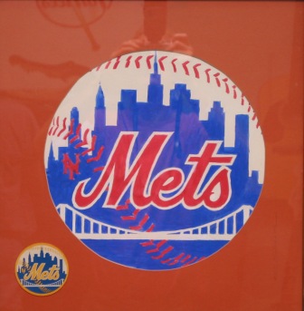
The shape of the insignia is a circular crest with an orange outline, with orange stitching superimposed, representing a baseball. The bridge in the foreground is a generic image of a suspension bridge in white, symbolizing the joining of New York's five boroughs. The ball contains a blue silhouetted representation of New York City's skyline against a white background, with the word "Mets" in orange cursive script outlined in white just below the center of the circle.
It's not just any skyline in the background, but has a special meaning. At the left is a church spire, symbolic of Brooklyn, the borough of churches. The second building from the left is the Williamsburgh Savings Bank, the tallest building in Brooklyn. Next is the Woolworth Building. After a general skyline view of midtown comes the Empire State Building. At the far right is the United Nations Building.
The Mets' colors, well established before the logo contest, became Dodger blue and Giant orange, symbolic of the return of National League baseball to New York after the Dodgers and Giants moved to California. Blue and orange are also the official colors of New York City.
1963 Topps- Mets logo
Early on there were a number of different versions, mostly for printing purposes.
For instance, the Mets logo used on the 1963 Topps baseball cards (left) is a pretty singular version, omitting the tiny stitching while making the sky orange, the skyline a lighter royal blue, and the cursive Mets name white.
In 1998 the Mets made a major addition to their color scheme, adding the black jerseys and caps, resulting in three logo changes. The dropping of the interlocking N.Y. on the left side (boooo!), a drop shadow added to the Mets cursive, and an alternate logo colored to go with the new black jerseys.
I was not a fan of the black jerseys (I still bought one, & the cap, gah!) but I did like the black version of the logo. I thought the drop shadow on the team name (also added to uniforms) was a great touch and a natural evolution in the design.
I did not like the decision to drop the interlocking N.Y.
It scared me. I thought maybe the team was thinking about moving to New Jersey, as I did a few decades earlier. I wouldn't wish that fate on anyone.
^Animated Mets logo by NYCMP1 (2010) _______________________________________________________________
More Recent Changes In The Logo
In recognition of its 50th Anniversary in 2012, the club restored its classic look by dropping the black alternate logo and phasing out the black jerseys and caps.The interlocking N.Y. is still left off. The drop shadow off the cursive, now slightly bloated Mets, is dropped. It looks great.
Since then there have been slight unannounced changes to the original Gotto design. In 2012 there was a change to the Williamsburgh Savings Bank building, slightly redefining it's distinctive shape. Most agree this was done unintentionally as the logo moved through different formats during the pre and post digital years.
Most recently there was a small controversy as the Mets twitter feed sent out a version of the logo that added the ex-Citi Bank building in place of the United Nations Building. It turns out this version of the logo surfaced some time ago. Both then and now it's been professed that it was released in error and that there have been no official changes to the design. The graphic was probably done by someone in the media department who wanted to have some fun with the logo.
Lets go take a peek at a possible change to the timeline.
>>>>>>>>>>>>>>>>>>>>>>>>>>>>>>>>>>>>>>>>>>
Mr. Radom's future logo
I see there are others who have access to a Tardis. Todd Radom, who has actually designed logos for the Mets (the 50th Anniversary), creates a new branch on the time-line with his nice futuristic design.
Mets 50th Anniversary Logo
Todd's 50th logo was an excellent job, like Gotto's 50 years before, perfect. IMO the N.Y. in the shaped home plate at the bottom was a beautiful touch.
I have always felt that the Mets should never change the team logo. Because it is perfection.
There are other sports teams with excellent logos but none encompass everything about a team so completely. Am I bias? Of course I am, I've been a Mets fan all my life. Still, aside from that, from an artistic point of view, all pride in my team aside, I believe it's true. The blue skyline in the logo is as recognizable to New Yorkers and baseball fans as the city's itself.
If the team ever decides to really make any changes to the logo I hope they make sure to have it re-designed by someone who cares. Someone who loves Gotto's original as much as anyone on this planet and knows the teams history and what that logo means to Mets fans.
Hey! I fall into that category.
An upgrade that respects Ray Gatto's original vision and sentiment. All the main buildings from the original concept are still included. The Freedom Tower and the Statue Of Liberty have been added. The interlocking N.Y. returns to its rightful place. And it's so close to the original you almost don't even see the changes, all the while bringing it into the 21st century. There is even room in the general skyline for two more future buildings, which can be added every 50 years. To decide the building, hold a contest or something. Some of the Mets best decisions were decided by contests.
If you want to go with a more drastic change you can replace the generic bridge with the Shea Bridge from Citi Field. Personally I feel this is a bit much (and I think Mets fans will flip if you change too much), but I do like the fact that it is something added to the logo that can represent two of the Mets home stadiums, Shea Stadium and Citi Field (I tried to work in the Polo Grounds but I couldn't come up with a way.).
I think it's very Gotto-like to update the logo so it somehow encompasses both the ballparks, and I could get used to it. I do believe that the Shea Bridge will become a very popular place for fans as the years pass, if it's not already.
This entire post came about when the news of the Citi Bank building change surfaced a few weeks ago. So I got started searching, looking for old pictures & info about the logo.
I came across this picture of the N.Y.C. skyline and it reminded me so much of the Mets logo that it gave me the idea to create a version of the logo using real pictures of the buildings in it.
I should have been working on game two of the 1973 World Series for this blog the last two weeks, but there it is. When I get sidetracked on this project I just go with it. I was planning on doing a page about the logo's history someday. This day is as good as any.
I ended up covering over much the original photo. A mirrored image of the Manhattan Bridge is used. I looked for "front on" photos of the original buildings, except for the U.N. building.
I wanted that to be seen at an angle.
These are the last two tests. For the final version I focused on the blue tinted one making some additions to give the skyline the proper balance, re-worked the bridge, darkened all the blue, especially near the bottom.
I'm working on a 2015 mfc fantazy slogan/realogo type of T and I'll keep you posted on that. An early design below.
MoJo Risin' is not the Mets official slogan for 2015. That's just the Mets Fantazy Card choice. I picked that for a number of reasons. There's already a bit of a Mets history involving the song/phrase and it fits. It might take a year or two to be where we want to be, but it starts with the expectations for next season.
I ran the Realogo by my friends in the Pool and I appreciate their input. I doubt they'll be too thrilled with my future logo. I doubt any Mets fan will be. Cause we don't really need a new logo. The original design is perfect. We need an outfielder and/or a shortstop, a power-hitter hopefully.
FOOTNOTE: I edited this out of the of the logo post for lack of conformation. Is This True? There is a story out there that Mets GM George Weiss took Ray Gotto's idea (draft? concept?) and brought it to Lon Keller, a brilliant sports cover artist who did cover art for almost every thing from high schools yearbooks right up to major league baseball and the NFL football.
He was credited with coming up with the Yankees top hat & bat logo, which then Yankee G.M. Weiss had commissioned in 1946. He designed all the classic Yankees World Series Program covers throughout the 1940's and '50s. This Yankee logo is a classic, and one of the best, but it does not beat the Mets logo. Nothing in that concept shows anything to represent New York. To me, that's a drawback.
Mr. Weiss asked Lon if he could incorporate any ideas of his own, and Mr. Keller supposedly did. One story has it that Kelley introduced the bridge to illustrate the connection between the 5 boroughs as well as some of the buildings choices. I have no idea if this is true, but unless this information can be disputed I will include it in the MFC historical record as a footnote. If it can be confirmed I'll move it up into the Mets logo story.